Plotting
Running your quasi-Seldonian algorithm one time and observing that it found a solution is encouraging—certainly more so than if it returned No Solution Found (NSF)! However, it doesn't tell us much about the algorithm's behavior. How much performance is lost due to the behavioral constraints? How much data does it take for the algorithm to frequently return solutions? How often does the algorithm exhibit undesirable behavior? Here we extend our code to provide answers to these questions. Below we first describe the experiment we ran and the results. At the end of this tutorial we encourage you to try to recreate these results, provide some tips, and provide our code.
Performance Loss
An algorithm that guarantees that it is safe and/or fair will typically have slightly worse performance than an algorithm that focuses purely on optimizing performance. The left column of plots in Figure 3 of our paper shows the slight decrease in predictive accuracy of our (quasi-)Seldonian classification algorithm due to enforcing the behavioral constraints. Similarly, in the supplementary materials of our paper, Fig. S19 shows how ensuring fairness in our GPA regression example results in a slight increase in the mean squared errors of predictions. For the problem we are solving, we will certainly increase the mean squared error, as our second behavioral constraint explicitly requires this. Still, it is worth comparing the mean squared error of the solutions returned by QSA to the mean squared error of the solutions that would be returned by a standard algorithm, in this case least squares linear regression (LS).
Each of the plots that we make here will show how different properties vary with the amount of data. In this section we plot performance (or in the case MSE, which is negative one times the performance) for different amounts of data. We use a logarithmic scale for the horizontal axis, and so we run our algorithm with values of \(m\) starting at \(m=32\) and going up to \(65,\!536\), doubling each time. For each value of \(m\), we run \(1,000\) trials. From each of these trials we store the MSE of the solution returned by QSA (the quasi-Seldonian algorithm you've written) and leastSquares (ordinary least squares linear regression).
This raises the question: how should we compute the mean squared errors of estimators (the estimators produced by our algorithm, and the estimators produced by least squares linear regression)? Typically we won't have an analytic expression for this. However, for synthetic problems we can usually generate more data. So, we will evaluate the performance and safety/fairness of algorithms by generating significantly more data than we used to train the algorithms. Specifically, in our implementation we train with up to 65,536 samples, and use 1,000 times as many to evaluate our algorithms: 65,536,000 samples.
The MSE plot that we obtained is below, which includes standard error bars and thin dotted lines to indicate the desired MSE range of \([1.25,2.0]\).
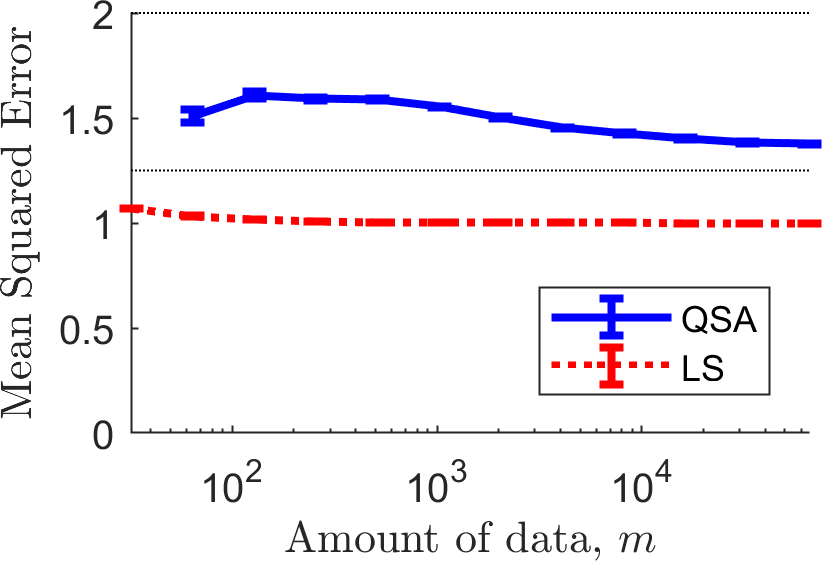
First, notice that QSA doesn't return a solution for small amounts of data, and so its curve does not begin at the far left where \(m=32\). Next, notice that overall the MSE of the solutions returned by QSA start closer to the middle of the acceptable range, and then tends down towards the lower boundary. This is because the primary objective function encourages solutions with lower MSE. With more data, QSA can return solutions with MSE closer to \(1.25\) while having the necessary confidence that its MSE remains above \(1.25\).
Probability of Solution
The previous plot made it clear that QSA didn't always return a solution. How much data does QSA require to return a solution for this problem? To answer this, we create a plot similar to the one above, but reporting the probability that each method returned a solution.
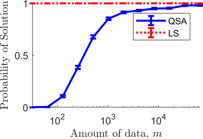
First, notice that LS always returns a solution, as it does not have the capacity to say "No Solution Found". Next, notice that QSA does not return solutions with little data: this is because it does not have sufficient confidence that any solution would have MSE above 1.25 and below 2.0. As the algorithm obtains more data, the probability that it returns a solution tends towards one. In our upcoming paper at NeurIPS,[link] we prove for a similar algorithm that, if a solution \(\theta\) exists that satisfies \(g_i(\theta) < 0\) for all \(i \in \{1,2,\dotsc,n\}\), then in the limit as the amount of data tends to infinity, the probability that it returns a solution goes to one. We therefore call that algorithm consistent. It remains an open question whether the QSA algorithm (assuming candidate selection finds a global maximizer of the candidate objective) is consistent.
Probability of Undesirable Behavior
Next we plot the probability that each algorithm produced undesirable behavior: the probability that each algorithm caused \(g_1(a(D)) > 0\) and the probability that each algorithm caused \(g_2(a(D)) > 0\). Recall that \(\delta_1=\delta_2=0.1\), so these probabilities should both be below \(0.1\) for QSA (or at least around \(0.1\), due to our reliance on a normality assumption when using Student's \(t\) statistic). However, since LS does not use these constraints, it will frequently produce what we have defined to be undesirable behavior. The plots below show the probability that \(g_1(a(D)) > 0\) (left) and \(g_2(a(D)) > 0\) (right).
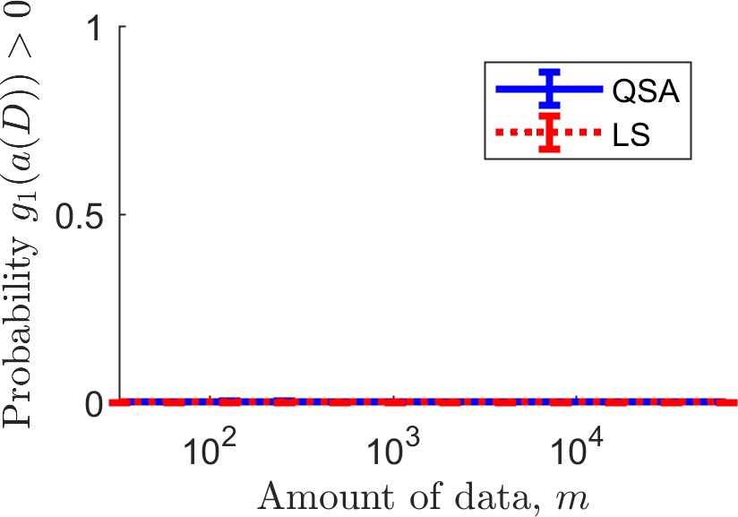
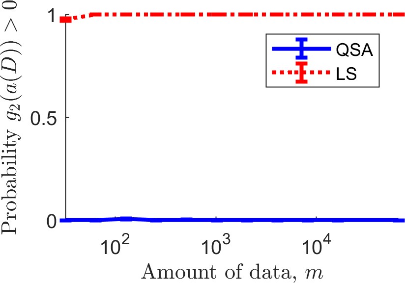
LS frequently violates the second constraint, producing solutions with MSE below \(1.25\). Of course we shouldn't expect any other behavior of LS, as it was not tasked with ensuring that the MSE is above \(1.25\) and below \(2.0\). The curve for QSA is the one of more interest: if it goes above \(0.1\) the algorithm did not satisfy the behavioral constraints (which could in theory happen here due to our reliance on the aforementioned normality assumption). The curve for QSA is not completely flat at zero: it goes up to a value of \(0.005\), which is well below our threshold of \(0.1\).
Source Code
You can download our source code to create the plots on this page by clicking the download button below:
C++:
This .zip file includes both our updated main.cpp and the outputs we obtained in the directory /output, along with Matlab code to create all of the plots in this tutorial (simply run main.m in Matlab). Other than the line #include<fstream>, all of our changes are below the QSA function. Notice in int main(...) that for two different values of \(m\), say \(m_1\) and \(m_2\) where \(m_1 < m_2\), within the same trial the first \(m_1\) samples in the training data will be the same for both values of \(m\). This use of common random numbers reduces the variance in plots.
Python:
To run this demo, you will need two additional libraries: Ray, to allow our code to run in parallel, and Numba, a Just-in-Time (JIT) compiler that accelerates Python code.
This .zip file includes both the original main.py file, for running our first, simpler experiment, and main_plotting.py, for reproducing the plots and analyses above. The results of each experiment (including output CSV files) are stored in the experiment_results/ folder. To generate the graphs above, please run main_plotting.py and then create_plots.py. All plots are saved in the images/ folder.